WRITTEN BY Cathy Austin
FEATURING Holly Hollingsworth Phillips
PHOTOGRAPHY Dustin Peck
FLOWERS BY Charlotte’s Garden
When Beth Smith and Holly Hollingsworth Phillips first met through a mutual friend, they bonded instantly over their mutual love of color and passion for interior design. Beth, her husband Kevin, son Mac, and daughter Lilli had relocated to Charlotte from New Jersey. Holly had helped the family with their first home and they adored her signature use of bold color and attention to detail.
When a favorite Myers Park Tudor home became available, the family jumped at the chance to rework the historic home that also suited the needs of their growing children. Built in 1928, the 6,000-square-foot residence had been through several renovations. Under Holly’s guidance, the house needed only cosmetic changes that included new paint and stain finishes, kitchen countertops, and an overhaul of all the lighting. Holly describes Beth’s love of lighting: “Beth has a bit of a lighting obsession and is incredibly organized…to say the least! She focuses on small details such as hinges and door knobs while I focus on big picture. Between those two things we made loads of changes without structurally changing things.”
The current interior of the house had been much darker and more traditional than the Smiths’ tastes. The goal was to make it a lighter, brighter and younger feeling home. They also wanted to ensure that they would use every room in the house. All of the furnishings from their previous home were reused in the new interiors, some reupholstered with new fabrics, and others set against different backdrops to make them feel fresh in the updated spaces.
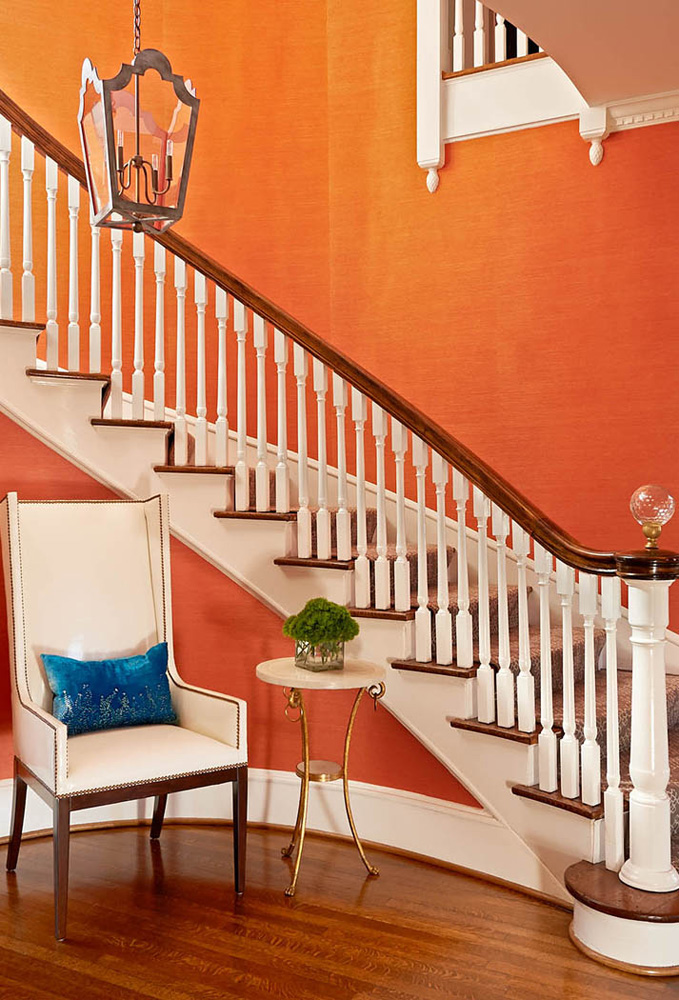
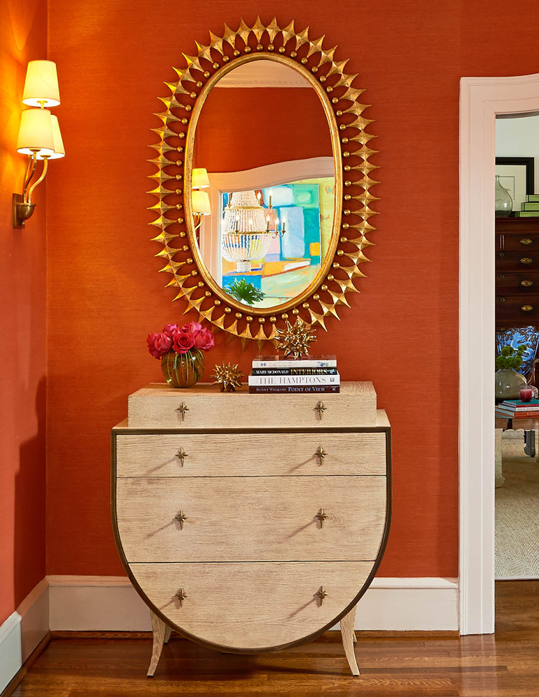
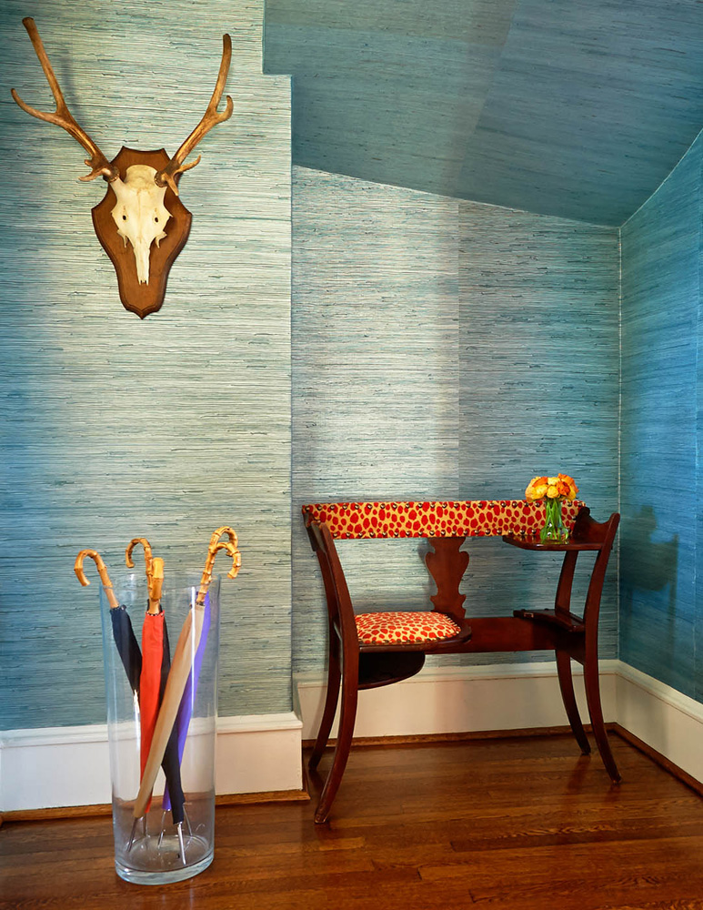
The entry hall with its dramatic sweeping staircase was clad in vibrant grasscloth. The client and designer share an affinity for wallpaper and would cover every wall and ceiling if they could. That single design trick elevated many spaces in the house from ordinary to extraordinary. Holly is well known for her love of orange. In addition to her fabulous orange English Room logo, she also has an orange jeep, golf cart, front door, accessories, paintings, and every shoe, accessory, and article of clothing that comes in her signature color. She had suggested grasscloth to add texture in this large space and to Holly’s pleasant surprise, orange was Beth’s idea. Holly was more than happy to accommodate the request. She elaborated on the color choice: “As Frank Sinatra said, ‘Orange is the happiest color.’ It sets the tone for this cheerful home. The color is perfect because it is certainly in the orange color family but it is the intersection between coral and persimmon with enough sophistication to not be jarring as the first thing you see.”
The entry hall also foreshadows what will be seen throughout the house as the color repeats itself to connect the visual dots throughout the interiors. Set against the colored textured walls are chests by Global Views and sculptural mirrors by Emporium Home, a favorite line of Holly’s that is relatively new on the scene. Holly admires owner Ashley Childers’ amazing style. She claims she would use every piece of theirs if she could.
As Frank Sinatra said, ‘Orange is the happiest color.’ It sets the tone for this cheerful home.
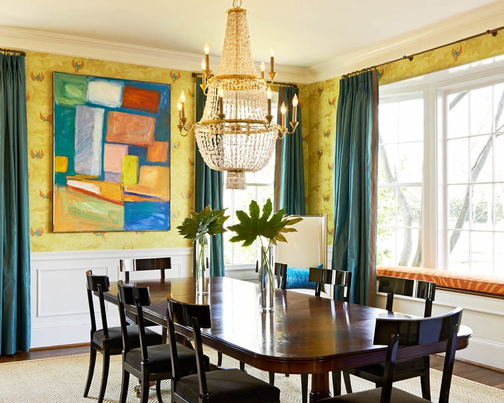
The dining room is decorated with a chartreuse, orange and peacock blue wallpaper by Osbourne and Little. The abstract painting is a vintage piece by Frances Deslonge. The family’s former dining room had a bold, yet neutral color scheme. The intensity of the new palette holds its own against the gorgeous architectural details including an amazing bay window that illuminates the space. The pink shell dining room chandelier by Currey & Co. was a leap of faith by the client. Holly knew it would be perfect for the space and promised the client that if she was not sold upon installation, she would find it another home. Needless to say, the chandelier remained in the space and looks amazing!
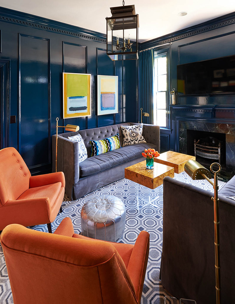
The midnight blue lacquered library is one of the family’s favorite spaces and evokes the biggest reaction from guests. Originally an outdated dark stained wood paneled room, the space came to life under six coats of Farrow and Ball’s “Hague Blue.” The Rothko-style art was a fun find from a local shop. The paintings transitioned beautifully from the family’s past dining room into the new space. The library grew organically as the client and designer found pieces along the way. The charcoal sofas from Lee industries juxtaposed against the Jonathan Adler wool felt chairs and tables are the perfect mix of modern with traditional. The jolt of orange upholstery also connects the eye from the entry hall through the library to the sunroom beyond.
The small side hall connecting the entry to the breakfast room is papered with a blue metallic grasscloth because the space needed more than paint. The antique telephone table was inherited from an aunt. It has found a place in the family’s last 3 homes.
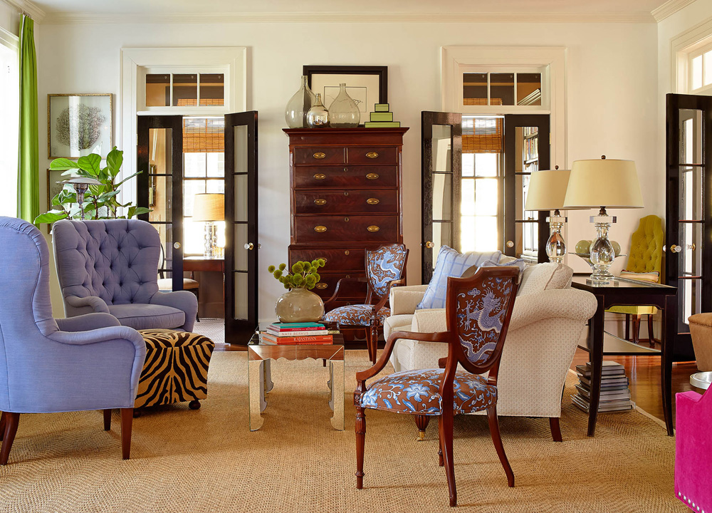
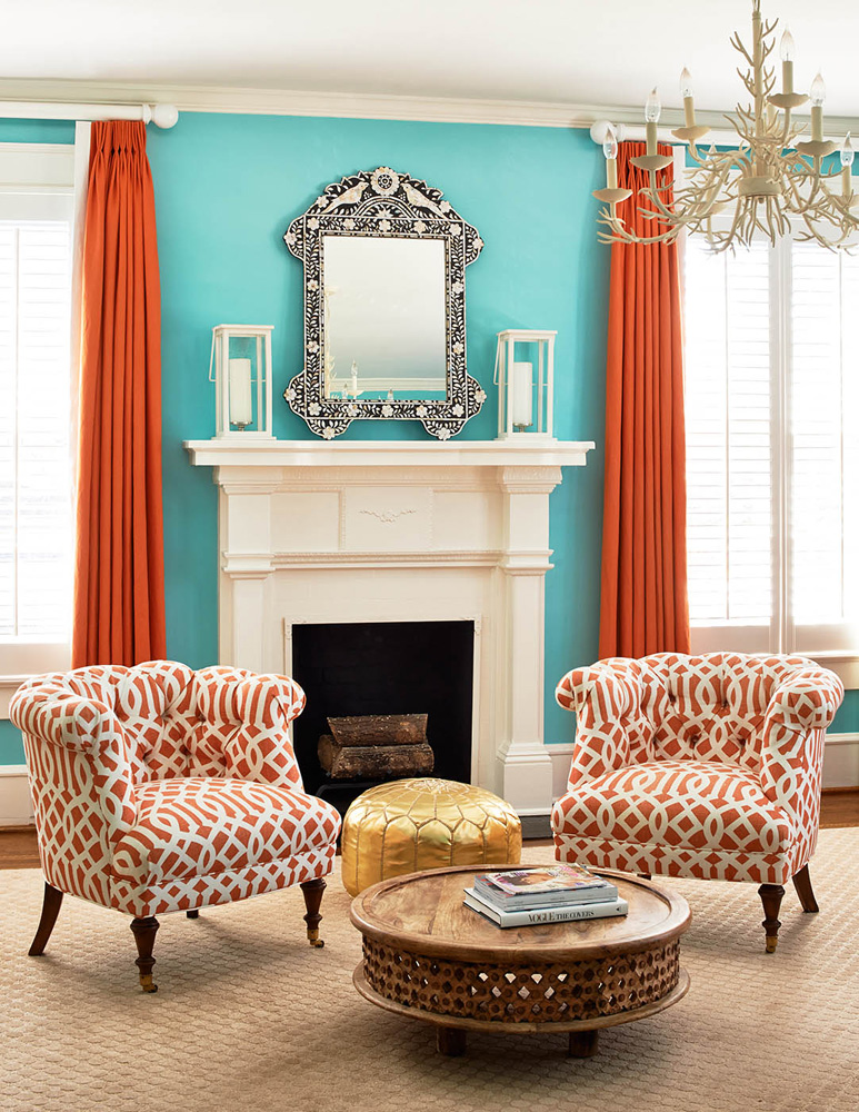
The gracious proportions of the living room allow for multiple seating areas. The original furniture plan from the previous residence took on an entirely different feel with the addition of a hot pink corner banquette and apple green linen window treatments with hand applied grosgrain fretwork. The window treatments softened the space while also adding another bold color. The draperies are always the “finishing touch” to an interior. They diffuse light and create an overall elegance.
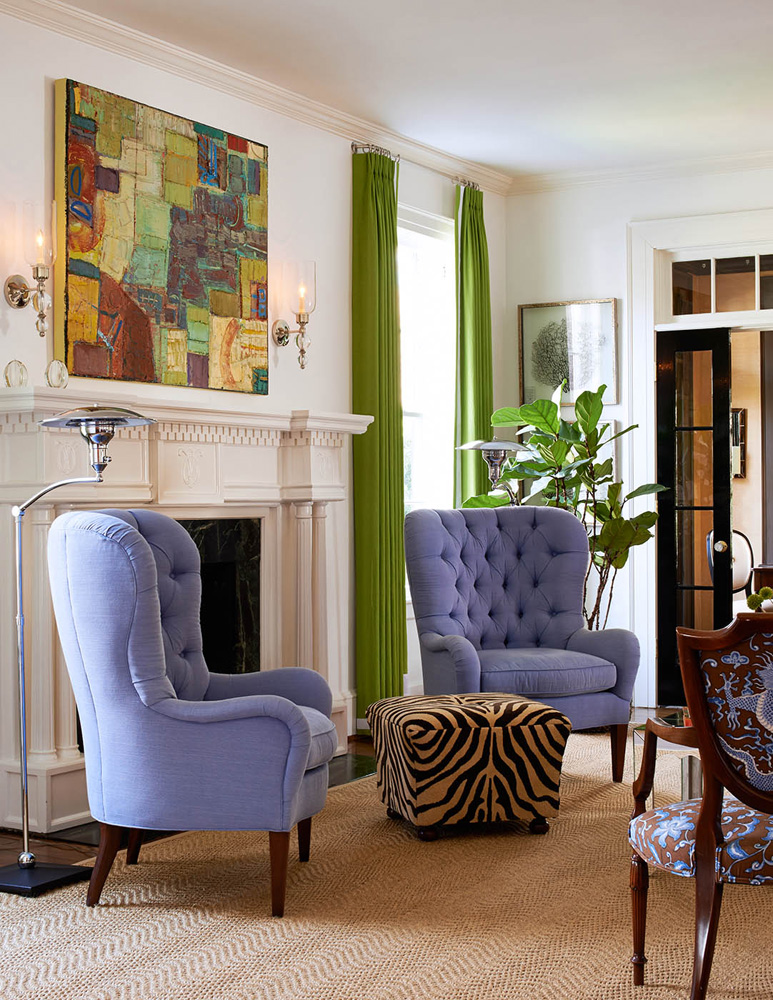
A painting by Chris Hayman from Hidell Brooks Gallery serves as a focal point above the fireplace. Based in California, Chris has been painting for more than 30 years and her work is held in many public and private collections across the country. Her abstract paintings are thickly layered with oil and she tends to always draw back into the paint to expose the many layers underneath. The painting also works as a critical piece of the interior’s color puzzle in that it contains every color of the palette.
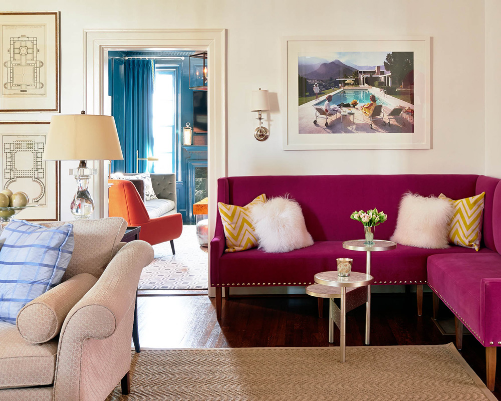
The large vacant corner called out for a custom banquette. The fearless color lovers emphatically chose a vibrant hot pink to animate the space. “Poolside Glamour” by Slim Aaron’s hangs above the banquette as a perfect counterpoint to the abstract painting by Chris Hayman.
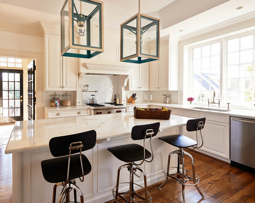
The kitchen is the family’s other favorite space in the home. Beth is an amazing cook and the family spends a great deal of time here. A clean, uncluttered space is punctuated with lanterns from Urban Electric Company. Beth had seen them in an advertisement several years ago and knew she had to have them in a future home. All of the other decorating decisions for this space were made based on these lanterns. Their custom “Calypso Blue” interiors is a colorful surprise that also draws the eye into Beth’s office which is wallpapered with a Katie Ridder wallpaper of the same color.
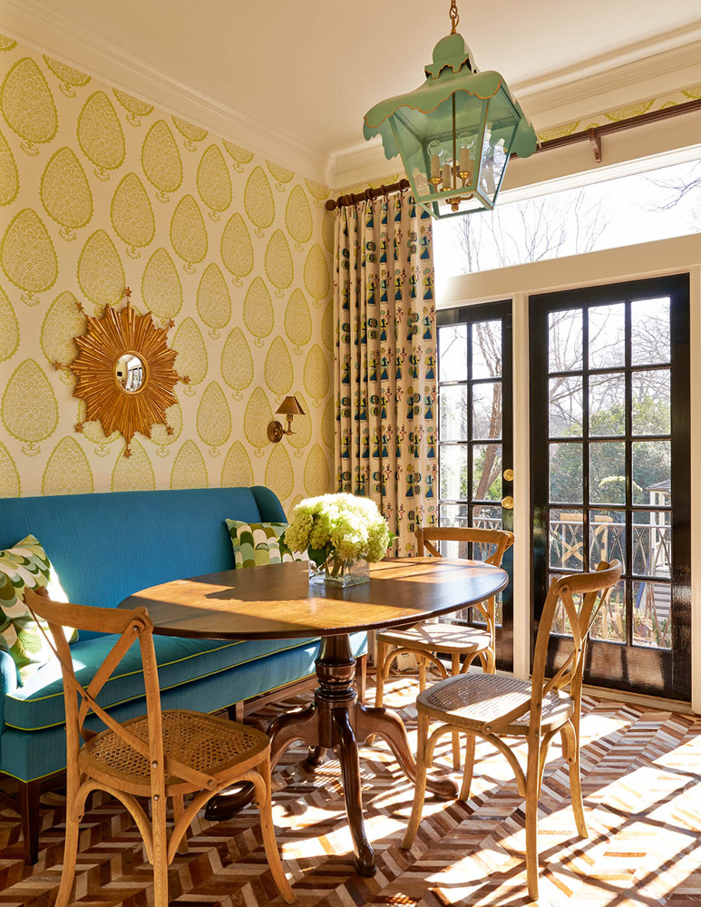
Just off of the kitchen, another stunning over-scaled wallpaper by Katie Ridder provided the starting point for the room. Holly added the “Attendants” fabric, also designed by Ridder, for the drapes to add another fabulous blue and green layer to the room. These hues offset the warmer colors used throughout the rest of the house. The lantern is by Coleen and Company and the banquette is upholstered in Sunbrella by Hickory Chair. The pieced hide rug is a very unexpected yet delightful choice that was found on a One King’s Lane flash sale.
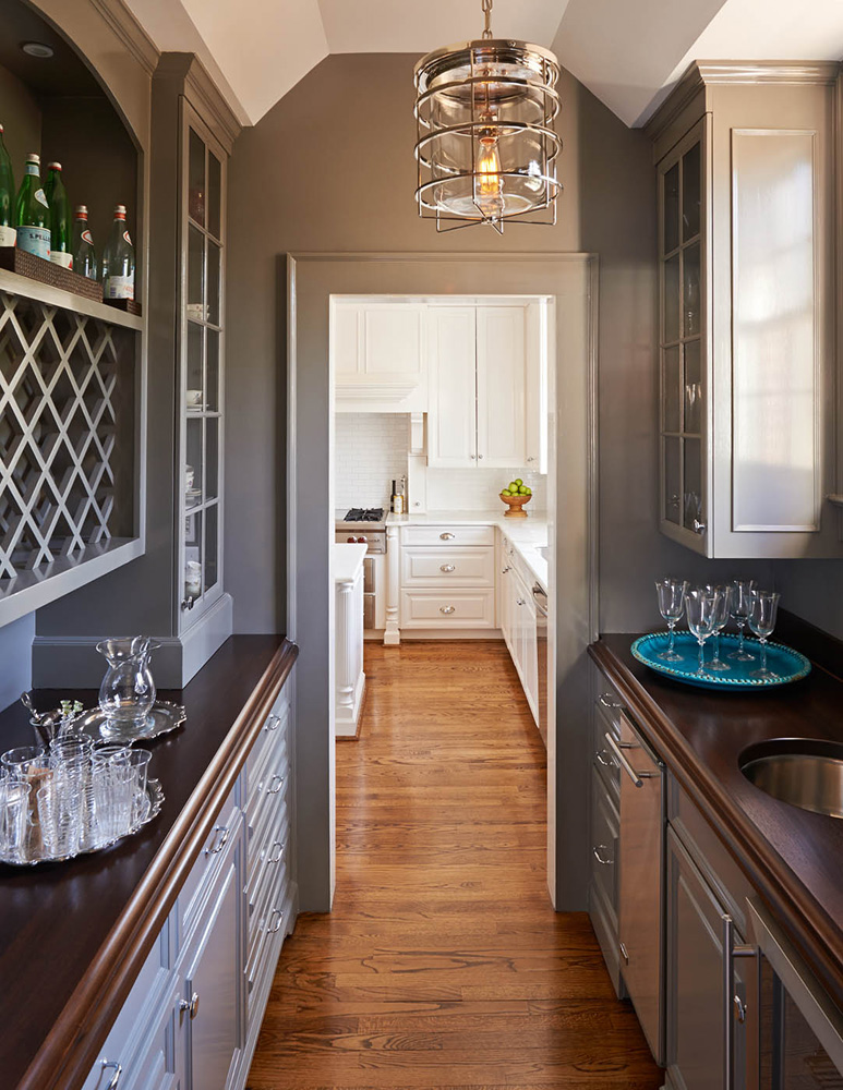
The butler’s pantry is highlighted by Chelsea Gray cabinets by Benjamin Moore and a modern industrial chrome pendant fixture from Visual Comfort. This pass-through bar from the kitchen to the dining area provides much storage for the home owners vast collection of china and is another visually interesting stop in the home.
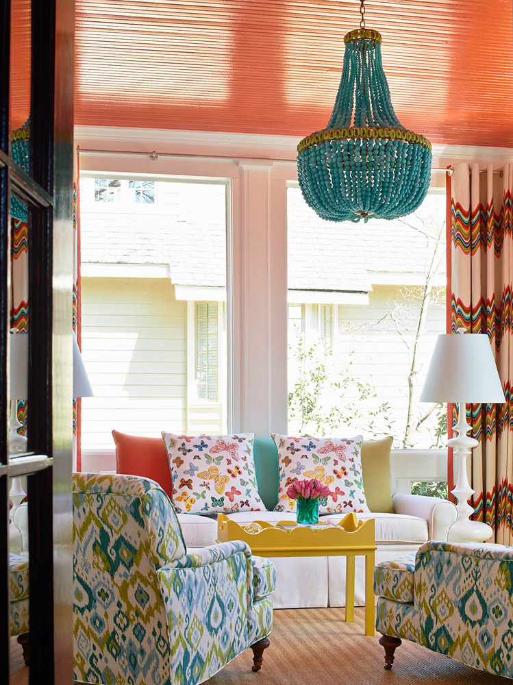
The wild and whimsical sunroom brings together the full spectrum of colors used throughout the house. A Jonathan Adler zig zag fabric by Kravet used for the drapes provided the starting point for the room. A sofa covered in child-friendly Sunbrella fabric is animated with Lulu DK Butterfly pillows by Schumacher. Club chairs were re-upholstered in a turquoise ikat from Duralee. The crowning glory of the room is the Currey and Company turquoise chandelier hanging from a painted coral ceiling, repeating the color theme introduced in the entry hall. The wallpaper is by Osbourne and Little. Holly loves the sheen of the paper combined with the bold high gloss black trim.
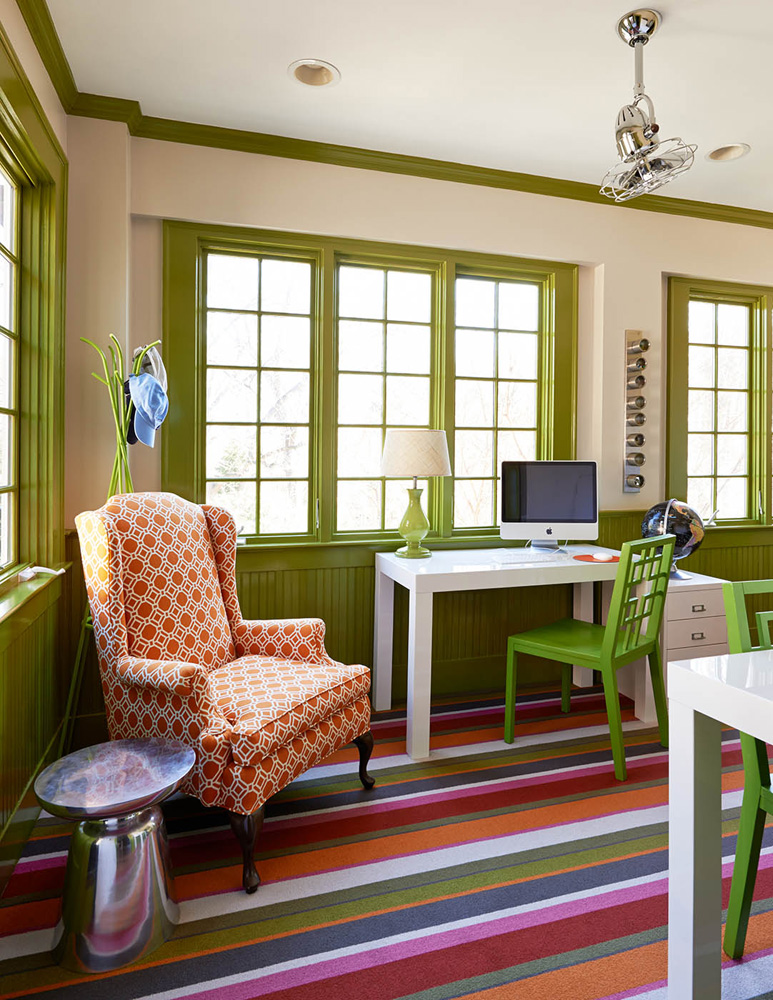
The upstairs of the home is equally as vibrant. A quirky stair landing became a charming study nook for the children. A multi-colored Missioni stripe rug by Stark brings the palette established downstairs to the second floor. Painting the trim in apple green is another unexpected, yet charming design choice.
In daughter Lilli’s bedroom, turquoise and coral delight once again. Small tub chairs were reupholstered in a Kelly Wearstler trellis fabric by Schumacher. The pop of coral also ties back into the entry hall color.
When asked about her proudest design moment, Holly said she was thrilled to see how the color puzzle came together. The scheme of coral, turquoise and peacock blue established in the entry hall is repeated in various doses throughout the interior connecting the eye from one space to the next. The vibrant facelift to this historic home was exactly what the clients and the designer envisioned.

ABOUT THE DESIGNER
Holly Hollingsworth Phillips is a residential interior designer, co-owner of The English Room and author of the popular blog, “Musings of a Design Aficionado.” She has completed homes all along the East Coast, which range from super-modern to very traditional while keeping it true to her colorful, eclectic and elegant style. Holly says, “Color makes people happy!” She loves mixing the tradition of the past with the modern style of the future.
Holly has worked in design from a very early age. Her mother, Nancy Hollingsworth, is a well-known interior designer, and specializes in the English Country style. Childhood play dates would turn into magical discussions with mothers while they moved around furniture. She accompanied her mother to antiques shows and went on her first European buying trip at age 12. Holly’s childhood home was designed by Mario Buatta, also known as “The Prince of Chintz.” She has fond memories of introducing Mr. Buatta to Chick-fil-a nuggets while discussing “decorating” as a third grader. Her lifelong passion for the decorative arts has never waned and led her to the profession of interior design.
Holly’s early experience includes working with Alexandra Stoddard and at Sotheby’s in New York City. In addition to completing a Mint Museum Senior Study, she also studied at the Atlanta Decorative Arts Center. After graduating with a degree in Art History from Rollins College, Holly attended the Sotheby’s 17th and 18th century decorative arts program in London. She has also completed The Winter Institute at Winterthur, which provided exposure to one of the most complete collections of American Antiques in existence. Her first “professional” job was with Travis & Company in Atlanta where she ran the Antiques side of the showroom. She earned another degree in Interior Design from the American College for the Applied Arts in Atlanta. In 1999, Holly joined her mother full time at the English Room in Charlotte.


[…] peachythemagazine.com, photogragy by Dustin […]